12 Best YouTube Thumbnail Fonts, Shown at Feed Size (2026)
By ThumbnailMaker Team · · 20 min read
Quick answer: the best fonts for YouTube thumbnails are heavy, tightly spaced sans-serifs. Use Anton, Impact, Bebas Neue or Oswald Bold for a headline of three to five words, Archivo Black or Montserrat Black for one or two big words, and Luckiest Guy, Titan One or Bangers for gaming, kids and challenge videos. They win for one reason: in the suggested-videos column on desktop a thumbnail is about 168 pixels wide, and at that size thin strokes are the first thing to fail. Light and script faces turn into a smudge. All eleven Google Fonts on this list are free for commercial use under the SIL Open Font License or Apache 2.0, and Impact ships with Windows, whose font FAQ allows it in images. If you want one answer, take Anton: condensed, heavy, free, and it fits four words across the frame. Whatever you pick, give the text a dark outline. The outline does as much work as the font.
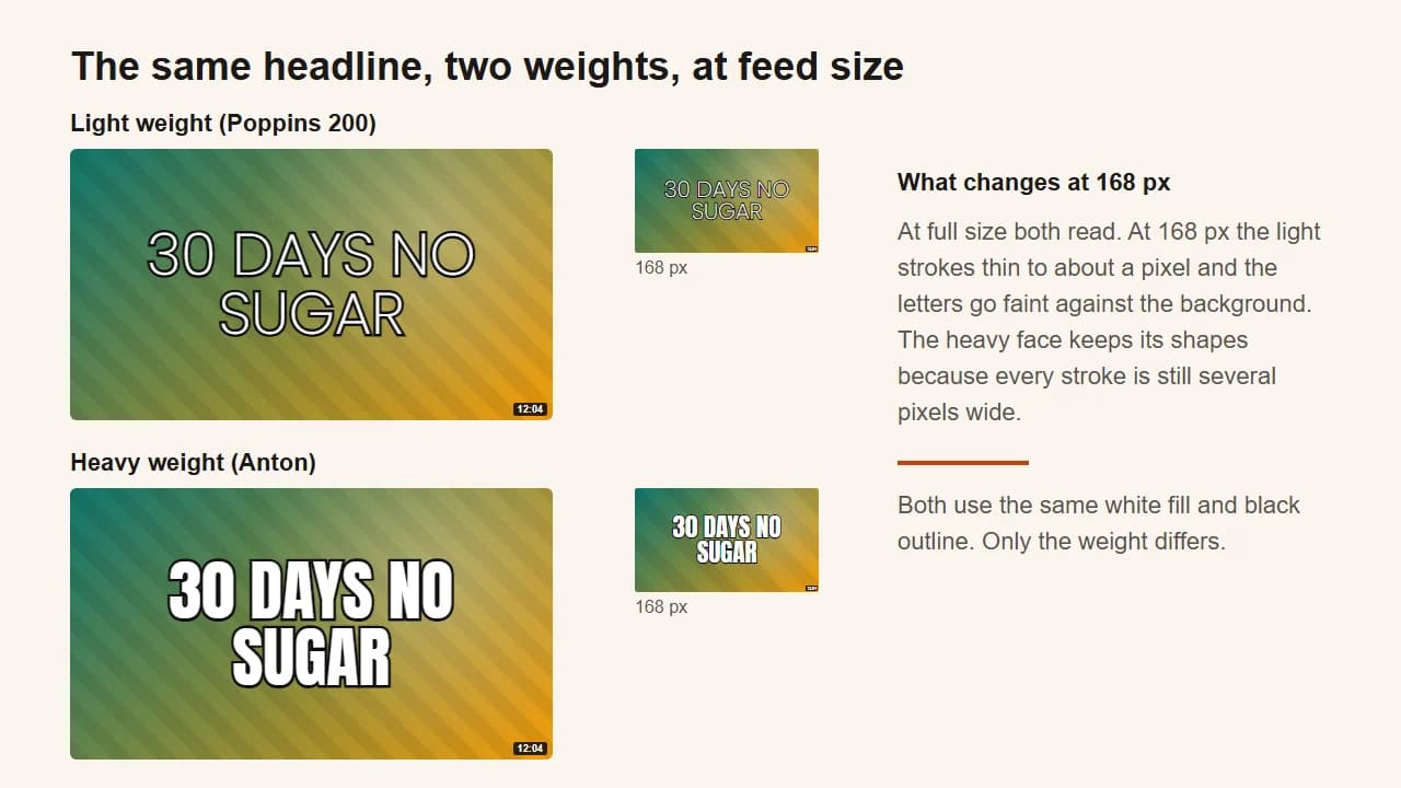
Many font lists show each typeface as a word on a white page, at 72 points, on the screen you designed it on. Nobody sees your thumbnail that way. On a phone's home feed it is bigger; in the desktop sidebar it shrinks to the width of a matchbox, next to a dozen others, while the viewer scrolls. A good thumbnail font has to survive the small case.
So every thumbnail font below is drawn twice: once at full size on a thumbnail-style background, and once at 168 pixels, the size of the suggested-videos column. The images are rendered from the font files themselves, with the same white fill and black outline, so the only thing that changes from one to the next is the font.
Which font is best for YouTube thumbnails?
Anton is the best all-round font for YouTube thumbnails, with Impact, Bebas Neue and Oswald Bold close behind for headlines of three to five words. Beyond that, the fonts for thumbnails that work fall into four families, and the family matters more than the name. Condensed headline faces (Anton, Impact, Bebas Neue, Oswald, Fjalla One) are tall and narrow, so a short sentence fits across the frame at a large size. Heavy wide sans faces (Archivo Black, Montserrat Black, Poppins ExtraBold) are blunter and take more room per letter, which suits one or two words. Playful display faces (Luckiest Guy, Titan One, Bangers) bring a gaming or comic-book tone. Hand-drawn faces (Permanent Marker) are for a short note, never the headline.
| Font | Best for | Style | Weight to use | Licence |
|---|---|---|---|---|
| Anton | The default headline | Condensed sans | Regular (only weight) | SIL OFL, free |
| Impact | The classic look with no download | Condensed sans | Regular (only weight) | Ships with Windows |
| Bebas Neue | Short all-caps statements | Condensed caps only | Regular (only weight) | SIL OFL, free |
| Oswald | Numbers and prices | Condensed sans | Bold (700) | SIL OFL, free |
| Archivo Black | One or two words read from across a room | Heavy grotesque | Black (only weight) | SIL OFL, free |
| Montserrat | A clean, modern channel brand | Geometric sans | Black (900) | SIL OFL, free |
| Poppins | Lifestyle, vlogs and routines | Geometric sans | ExtraBold (800) | SIL OFL, free |
| Fjalla One | Commentary, news and explainers | Condensed sans | Regular (only weight) | SIL OFL, free |
| Luckiest Guy | Gaming challenges | Rounded display | Regular (only weight) | Apache 2.0, free |
| Titan One | Kids and family channels | Rounded display | Regular (only weight) | SIL OFL, free |
| Bangers | Action and boss-fight moments | Comic-book display | Regular (only weight) | SIL OFL, free |
| Permanent Marker | Small annotations and arrows | Hand-drawn marker | Regular (only weight) | Apache 2.0, free |
The order is a judgement, not a measurement: the faces that work for the widest range of videos come first. There is no published count of which fonts YouTubers use most, so this list doesn't pretend there is one.
1. Anton, best for the default headline
Anton is the font to start with when you don't know which one to pick. Google Fonts describes it as a reworking of a traditional advertising sans-serif, with the stems tuned for use as a bold display face, and that is exactly what a thumbnail headline needs: tall letters, thick strokes, and tight spacing, so four words fit across the frame without shrinking. It holds up well at 168 pixels, helped by counters (the holes in letters like A and O) that were opened up slightly in the digital version. It comes in one weight, and that weight is the right one.
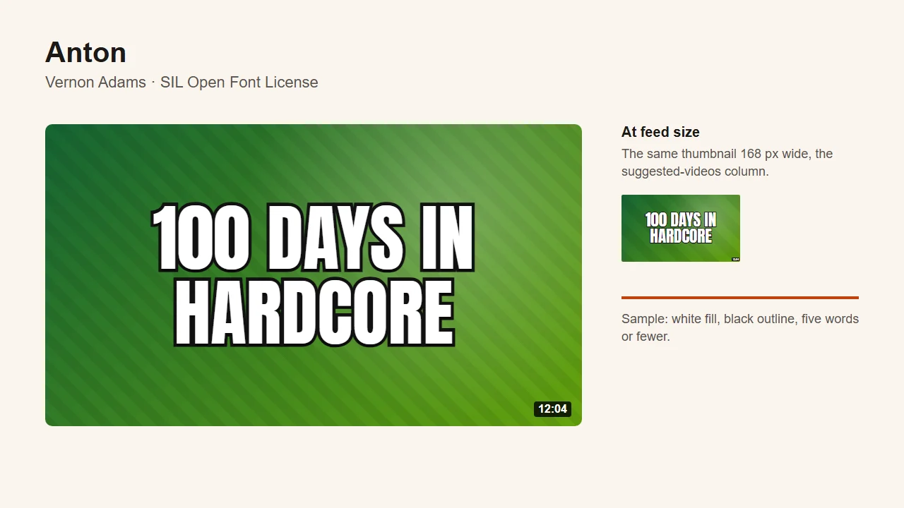
- Best for: challenge, survival and "100 days" videos; any headline of three to five words.
- Licence: SIL Open Font License, designed by Vernon Adams. Get it from Google Fonts.
- Watch out for: it's everywhere, so on its own it won't make a channel recognisable.
2. Impact, best for the classic look with no download
Impact is the face most people picture when they think of a thumbnail or a meme, and it has been around far longer than YouTube. Microsoft's typography page credits Geoffrey Lee, who designed it in 1965 for the Stephenson Blake foundry, and it has shipped with Windows since the 1990s. It is close to Anton in shape, slightly wider and blunter. The practical reason to use it: on Windows you already have it, so there is nothing to install. Microsoft's font redistribution FAQ says it treats "creating graphic files as being essentially the same as printing", so a thumbnail made with it is fine to publish.
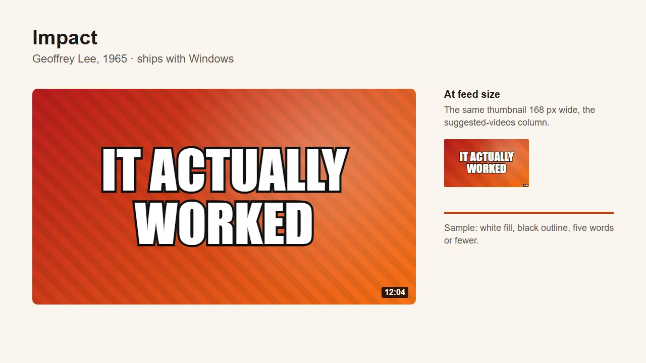
- Best for: reaction and result videos ("it worked", "it failed"); anyone editing on Windows who wants zero setup.
- Licence: a Monotype font supplied with Windows; see the Impact page on Microsoft Learn.
- Watch out for: reads as meme lettering to some audiences; you can't self-host it on a website, only use it in images.
3. Bebas Neue, best for short all-caps statements
Bebas Neue is a condensed display face by Ryoichi Tsunekawa, built from his original Bebas typeface, and it has one quirk worth knowing before you use it: it has no lowercase. Type "quit" and you get "QUIT". It also looks cleaner and more editorial than Anton or Impact. Its strokes are slightly lighter than Anton's, so it needs the outline more, and it reads best with three or four short words rather than a long line.
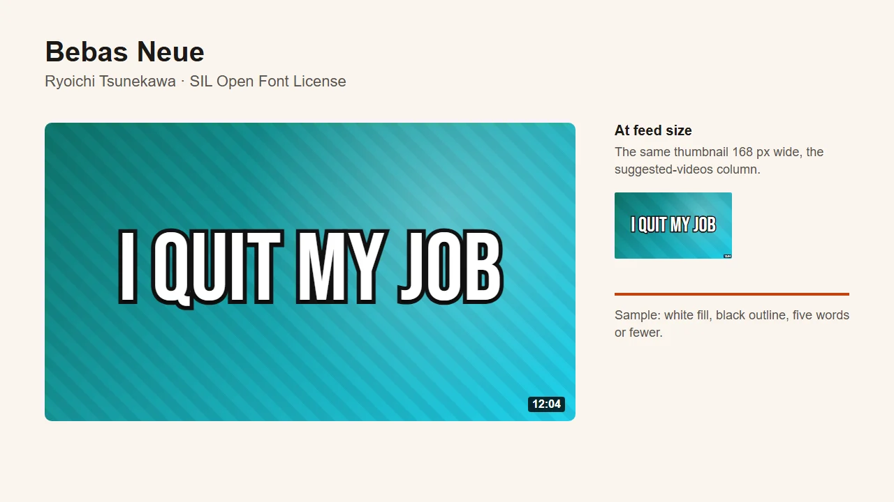
- Best for: story and life-update videos; finance and business channels that want a sharper look than Impact.
- Licence: SIL Open Font License. Get it from Google Fonts.
- Watch out for: capitals only; lighter strokes than Anton at the same size.
4. Oswald, best for numbers and prices
Oswald is, in Google Fonts' words, a reworking of the classic "Alternate Gothic" style of condensed sans-serif, started by Vernon Adams and later extended by other designers. Unlike Anton and Bebas Neue, it is a variable font with weights from 200 to 700, which matters for one reason: use 700. The lighter weights look elegant on a website and vanish on a thumbnail. Its figures are clear and evenly spaced, so "$1 VS $1,000" or "24 HOURS" reads cleanly, which is why it gets the numbers job here.
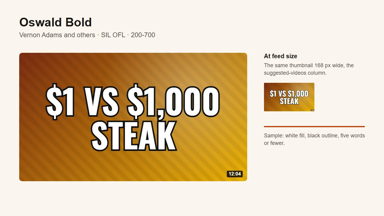
- Best for: price comparisons, budget challenges, countdowns and anything with a number in it.
- Licence: SIL Open Font License. Get it from Google Fonts.
- Watch out for: the default weight in many apps is 400, which is too thin for a thumbnail. Check it says Bold.
5. Archivo Black, best for one or two words read from across a room
Archivo Black is the heaviest grotesque here, from the Archivo family by Omnibus-Type, which describes it as built for highlights and headlines and reminiscent of late nineteenth-century American type. It is wide, so it can't hold a sentence. When the thumbnail needs one loud word ("STOP", "DON'T", "BANNED"), Archivo Black fills the space with almost no gap inside the letters, and it still reads at 168 pixels when a condensed face would need more words to fill the same width.
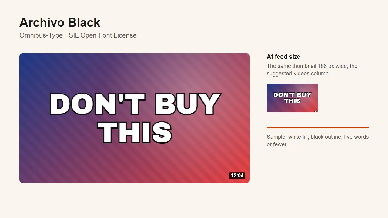
- Best for: review warnings, product verdicts, one-word reactions.
- Licence: SIL Open Font License. Get it from Google Fonts.
- Watch out for: wide, so long words break onto two lines quickly.
6. Montserrat, best for a clean, modern channel brand
Montserrat is a project led by Julieta Ulanovsky, inspired by the old posters and signs of the Montserrat neighbourhood of Buenos Aires. It is a geometric sans with a variable weight axis from 100 to 900, and for thumbnails you want the far end: Black, 900. At that weight it looks modern and tidy rather than shouty, which suits channels whose whole look is clean: tech, design, education. It is also a font a channel can use everywhere else, from the banner to the website, because the lighter weights work for body text.
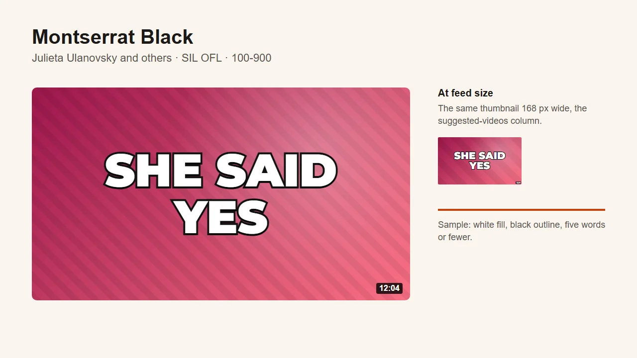
- Best for: channels with a consistent brand look; tech, design, education and wedding or event videos.
- Licence: SIL Open Font License. Get it from Google Fonts.
- Watch out for: less energy than the condensed faces; the light weights are a trap.
7. Poppins, best for lifestyle, vlogs and routines
Poppins is a geometric sans from the Indian Type Foundry, with nearly even strokes and round letters that look friendlier than Montserrat's. At ExtraBold (800) it has enough weight to read at feed size while still looking soft. That combination fits videos where the creator, not the drama, is the draw: morning routines, "what I eat in a day", study vlogs. Poppins ships nine weights, from 100 to 900, and only the top two belong on a thumbnail.
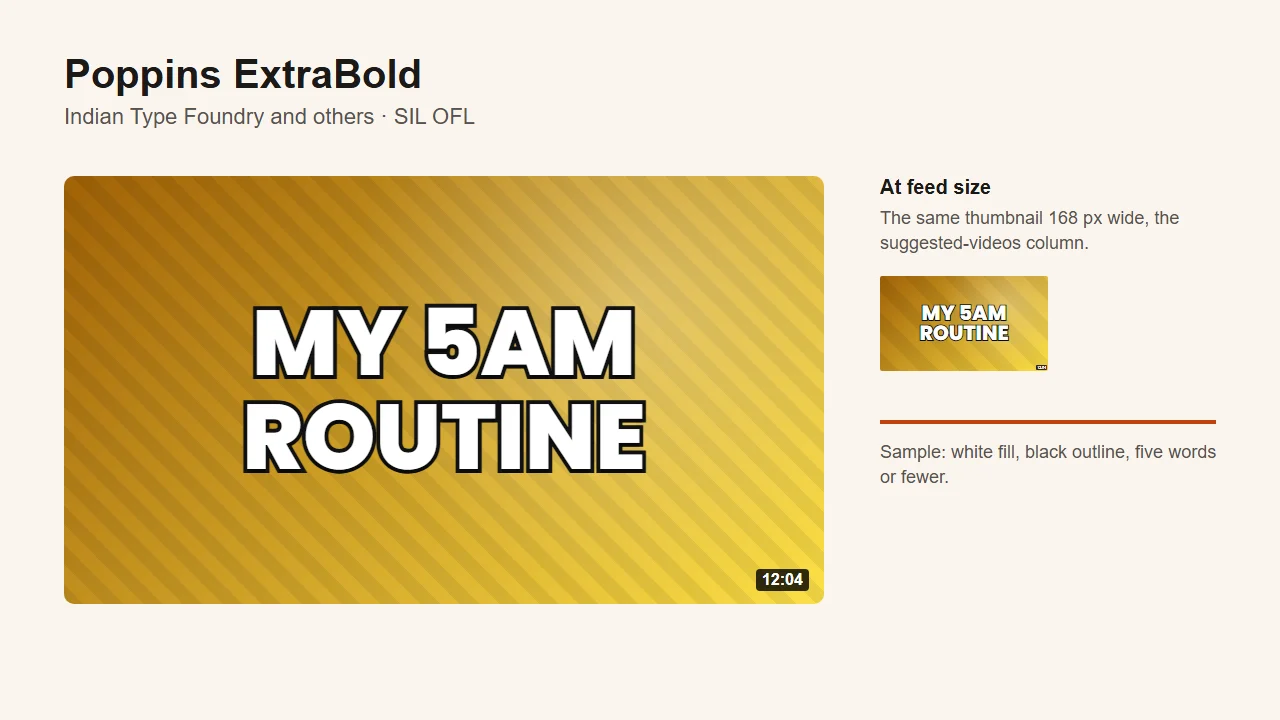
- Best for: lifestyle, beauty, study and routine videos.
- Licence: SIL Open Font License. Get it from Google Fonts.
- Watch out for: wider than the condensed faces; the round O and 0 can look alike in numbers.
8. Fjalla One, best for commentary, news and explainers
Fjalla One is a condensed display sans from Sorkin Type, described by its designers as medium contrast and adjusted to the restrictions of the screen. It is narrower and less heavy than Anton, with a slight variation between thick and thin strokes that makes it look like a newspaper headline rather than a poster. For commentary, news recaps and explainers, that is a better signal than the shouting energy of Impact. It needs a solid outline or a dark block behind it, because its strokes are lighter than Anton's or Impact's.
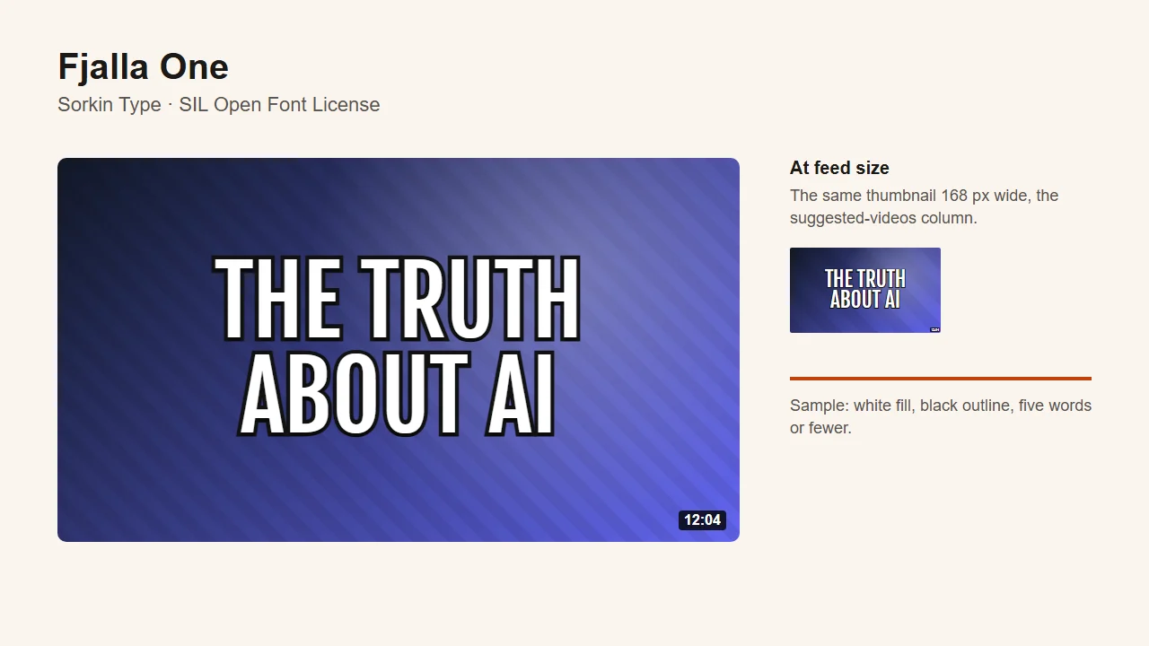
- Best for: commentary, news, documentaries and explainers.
- Licence: SIL Open Font License. Get it from Google Fonts.
- Watch out for: lighter than the other headline faces, so it fades faster on a busy background.
9. Luckiest Guy, best for gaming challenges
Luckiest Guy, from the Astigmatic foundry, is a heavyweight sans inspired by hand-lettered 1950s advertising. Its letters are fat, slightly uneven and bouncy, which reads as fun without the comic-book specificity of Bangers. That tone fits gaming challenge thumbnails, from "1 HP" runs to "only one block" builds. It stays legible at 168 pixels because the strokes are thick and the inside spaces small, so there is little for the shrink to erase.
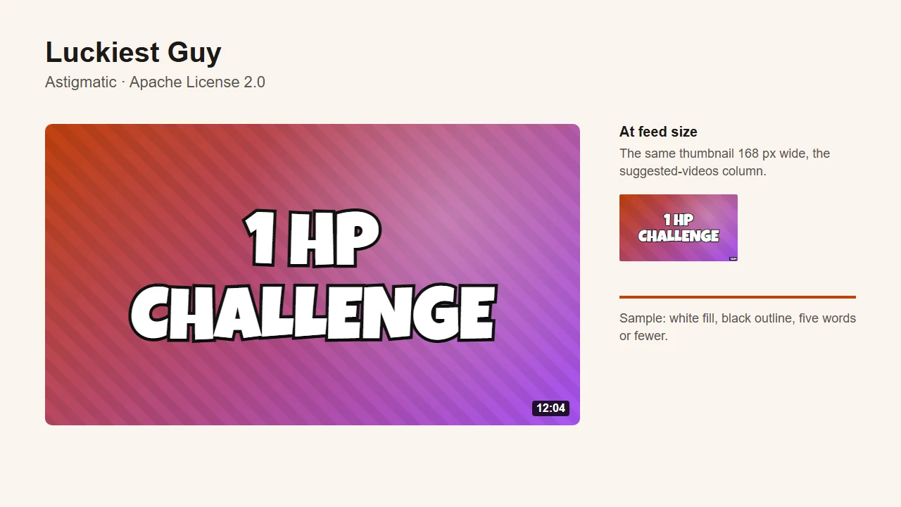
- Best for: Minecraft, Roblox and other gaming challenges; any video where the tone is playful.
- Licence: Apache License 2.0. Get it from Google Fonts.
- Watch out for: wrong for anything serious; wide, so keep it to two or three words.
If your channel is in this category, the thumbnails for gaming channels page shows the full look, image included.
10. Titan One, best for kids and family channels
Titan One by Rodrigo Fuenzalida is, in its own description, "a really fat display type with a happy and cheerful personality", drawn from hand lettering made with big brushes. It is rounder and softer than Luckiest Guy, with no sharp corners, which reads younger. For kids' content, toy reviews, slime and craft videos, that softness is the signal. Past three words it starts to feel crowded.
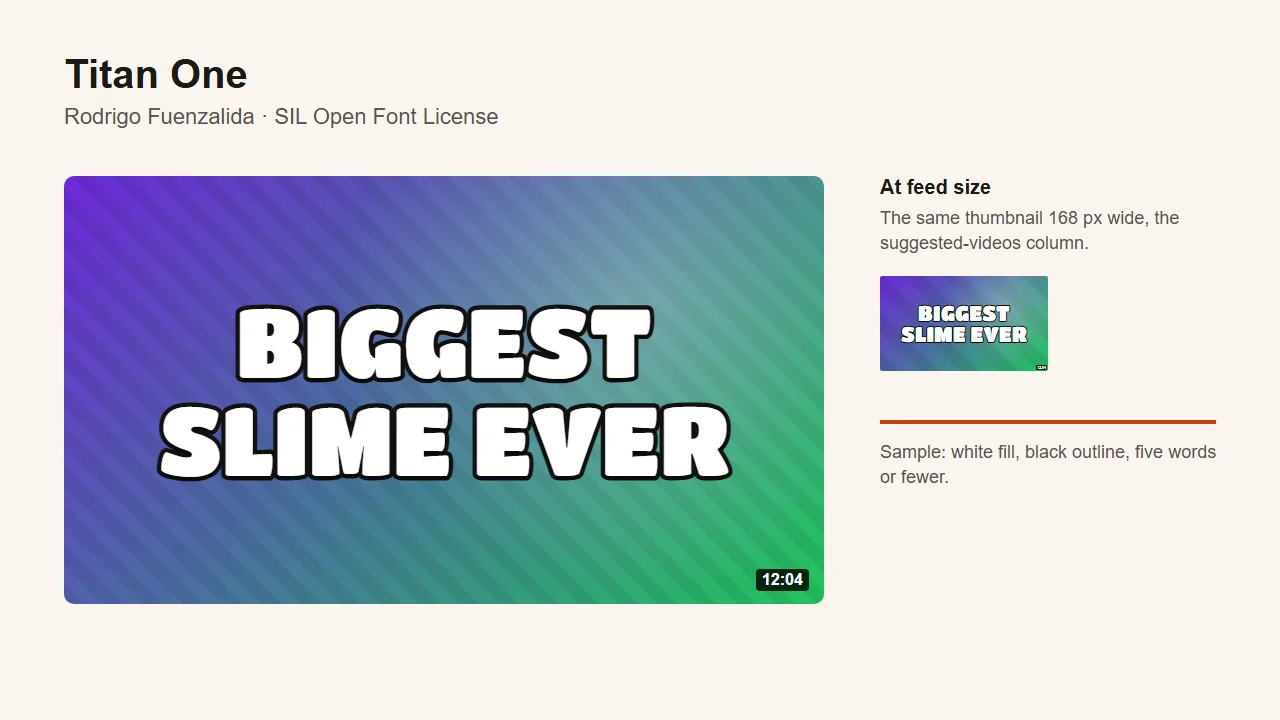
- Best for: kids, family, toys, slime and craft videos.
- Licence: SIL Open Font License. Get it from Google Fonts.
- Watch out for: too young for most adult audiences; crowded beyond three words.
11. Bangers, best for action and boss-fight moments
Bangers, another Vernon Adams design, was drawn in the style of mid-twentieth-century superhero comic covers. Its letters lean forward and are cut at angles, so they look like they are moving. That makes it the right face for a single dramatic moment: a boss fight, a clutch play, a "FINAL ROUND". Use it for one punchy phrase, not a full sentence, or the slant starts to look like a typo.
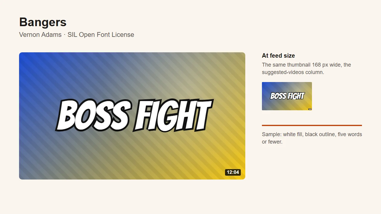
- Best for: gaming highlights, boss fights, sports clips and anything with a "moment".
- Licence: SIL Open Font License. Get it from Google Fonts.
- Watch out for: too stylised for a whole channel's brand; tires the eye beyond two or three words.
12. Permanent Marker, best for small annotations and arrows
Permanent Marker, from Font Diner, looks like it was written with a felt-tip, and it is the only hand-drawn face on this list for a reason: it works for a note, not a headline. "Wait for it" beside an arrow, "$4" scribbled near a product, "me" pointing at a person. Set the headline in it and it turns to scribble at 168 pixels; keep it to one short line and it reads.
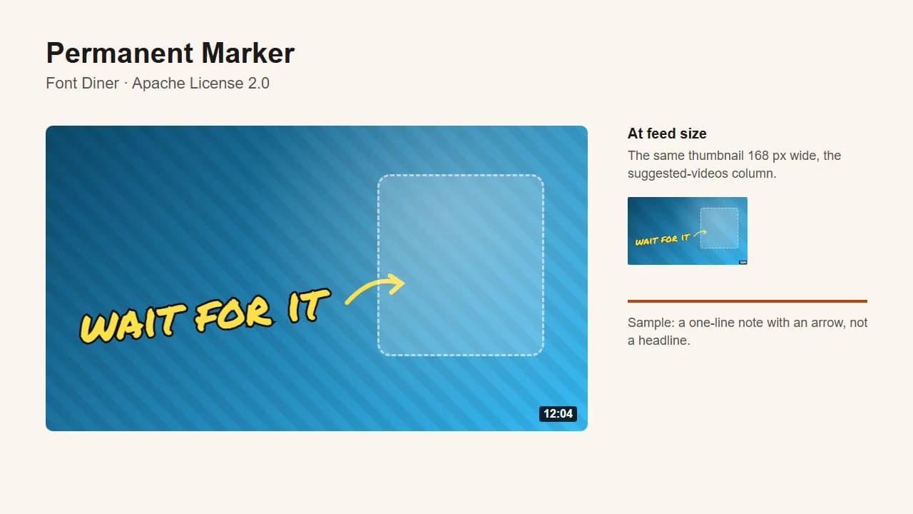
- Best for: arrows, labels and asides on top of a main image; vlogs and reaction videos.
- Licence: Apache License 2.0. Get it from Google Fonts.
- Watch out for: unreadable as a headline at feed size.
How to choose a YouTube thumbnail font
Choosing comes down to five questions, and the first one rules out half the list.
How many words does the line need?
One or two words: a wide, heavy face, Archivo Black or Montserrat Black. Three to five: a condensed face, Anton, Impact, Bebas Neue or Oswald. More than five: the problem isn't the font. Text on a thumbnail should support the image, not narrate it, and five words is already a full sentence at feed size. Cut words before you go looking for a narrower font.
Can you read it at 168 pixels?
This is the test that matters, and you can't run it on a full-size canvas. Shrink the thumbnail to 168 pixels wide and look again: if a word turns to grey texture, the weight is too light or the line too long.
The free thumbnail text editor does this as you type: it has all twelve fonts on this list plus Arial Black and Verdana, an outline on every line, and a feed-size preview next to the canvas, all in the browser with no account. Once the image is finished, the YouTube thumbnail tester shows it in a mock feed beside real-looking titles, at the same 168-pixel size.
What's behind the text?
A busy photo or a bright sky will eat white letters, whatever the font. The fix is the outline, or a solid dark block behind the line, not a heavier typeface. Every specimen above uses a thick black outline for exactly this reason. Keep the text away from the bottom-right corner too: YouTube puts the video length there, over whatever you designed.
Does the font match the video?
A font sets the tone before anyone reads the words. Rounded display faces (Titan One, Luckiest Guy) say games and kids; Fjalla One and Montserrat say information; Impact and Anton say something happened. A bubble font on a serious documentary tells the viewer the wrong thing. Pick one or two faces for the channel and keep them, so a subscriber recognises your thumbnail before reading your name.
Are you setting the text yourself, or letting AI draw it?
If you add text to an image you already have, any font above works, in any editor. If an AI image model draws the whole thumbnail, text included, you can't pick a font file at all, because the model draws the letters itself. Our AI YouTube thumbnail maker is built around that limit: instead of a font menu, it offers five text styles described in the terms the model actually follows (heavy condensed caps, bold sans-serif, thick outline, handwritten marker, editorial serif). "Heavy condensed caps" gets you the Anton and Impact look; it won't get you Anton exactly, and the generator doesn't pretend it will.
Frequently asked questions
What font do most YouTubers use for thumbnails?
A heavy, condensed sans-serif in capitals: Impact, Anton, Bebas Neue or something close. Gaming thumbnails often use fat rounded faces like Luckiest Guy instead. Nobody publishes a count, so treat any exact "most used" ranking as a guess; the shape matters more than the name.
Are these fonts free for commercial use on YouTube?
Yes. The eleven Google Fonts here are licensed under the SIL Open Font License or the Apache License 2.0, both of which allow commercial use, including in monetised videos and thumbnails. Impact is a Windows font. Microsoft's font FAQ treats an image made with it like a printout and doesn't restrict selling either, unless the app you used is licensed for non-commercial use only. Fonts from "free font" sites are a different story: many are free for personal use only, so read the licence before a monetised video.
What font does YouTube use?
YouTube's interface uses Roboto, Google's system font, and its brand uses a custom typeface called YouTube Sans, introduced in 2017, according to Google Design's case study. Neither is a thumbnail font. Roboto at its regular weight is too light for a thumbnail, and nothing about your thumbnail has to match YouTube's own lettering.
Should text on a thumbnail have an outline?
Almost always. A black or dark outline, or a solid block behind the text, is what keeps white letters readable over a bright or busy background. Without it, a perfect font still disappears into the image. The only case to skip it is dark text on a plain light background, where the contrast already exists.
How many fonts should a thumbnail use?
One, sometimes two. Most thumbnails carry a headline and, at most, a smaller line that qualifies it, and the second line can use the same font at a smaller size. If you add a hand-drawn note like Permanent Marker, that is your second font. Three fonts on one thumbnail reads as clutter at 168 pixels.
Which fonts should you avoid on a thumbnail?
Thin and light weights, script and calligraphy faces, and anything with fine detail, because those are the first things to vanish at 168 pixels. The same family can be right or wrong depending on weight: Montserrat Black works, Montserrat Light doesn't. Serifs are not banned, but only heavy ones with thick strokes hold up; a delicate book serif reads as grey texture at feed size.
Is there a text style generator for YouTube thumbnail text?
Yes, but check what kind. Many "text style generators" output Unicode lookalike characters for titles, bios and comments; they change characters, not images, so they can't style a thumbnail. For thumbnail text you need an editor where you pick a real font and add an outline, like the free text editor above. If an AI model draws the whole thumbnail, you describe the style instead: ThumbnailMaker's generator offers five text styles, such as heavy condensed caps, thick outline and handwritten marker.
How do I add text to a YouTube thumbnail for free?
Use a browser editor that doesn't need an account. Paste the video link or upload the image, type the line, pick the font, add an outline, and download the result as a PNG. Then upload it in YouTube Studio as the custom thumbnail (from the phone app the limit is 2 MB, see the YouTube thumbnail size guide); adding a custom thumbnail to YouTube walks through that part step by step.
The fonts are only the last step of a thumbnail. The image underneath still has to carry the idea, which is what making a thumbnail that gets clicks covers.
ThumbnailMaker is an independent product and is not affiliated with, sponsored by, or endorsed by Google, Microsoft, Monotype or any of the type designers and foundries named here. Font names are trademarks of their respective owners, named here only to describe publicly documented typefaces. Font details were checked against the Google Fonts repository and Microsoft's typography pages on 18 October 2026 and may have changed since.
ThumbnailMaker Team — Guides from the people building ThumbnailMaker: thumbnail design, CTR, and what happens under the hood of an AI generator. Every number is checked against YouTube's own pages and dated.
Try it on your next video
Paste the video's link: the brief is written for you, then you generate. 60 free credits, no card.