How to Make Thumbnails for YouTube: 6 Steps That Get Clicks
By ThumbnailMaker Team · · Updated · 8 min read
Skip the theory — generate your thumbnail now
Plans from $12 a month for 40 thumbnails.
Quick answer: to make a YouTube thumbnail that gets clicks, decide the one thing the video is about, then build the image around that single subject: usually a face, sometimes an object when the object is the story, never the subject plus the product plus a screenshot plus three arrows. Give that subject strong contrast against the background, because contrast is what lets someone register the image while scrolling. Add text only if it says something the image cannot: five words or fewer. Compose in 16:9 and export at 3840 × 2160, the size YouTube now recommends (1280 × 720 is still accepted). Keep the bottom-right corner clear, because YouTube stamps the duration badge there whatever you put underneath. Then shrink it to 168 pixels wide, the suggested-videos column, and check it still reads. If it does, upload it; if not, you now know what to simplify.
A thumbnail has less time to earn a click than a dating-app photo gets before a swipe. It has to be understood instantly, at a size smaller than a postage stamp on most phones. The six steps below are in the order the work actually happens.
Step 1: decide the one thing the video is about
The single most common mistake is cramming in everything the video contains: the subject, the product, a screenshot, three arrows and a circle. At thumbnail size, all of that becomes noise and nothing reads. Pick one focal point. Usually a face, sometimes an object if the object is the story (an unboxing, a before/after). Everything else in the frame supports that one thing or leaves.
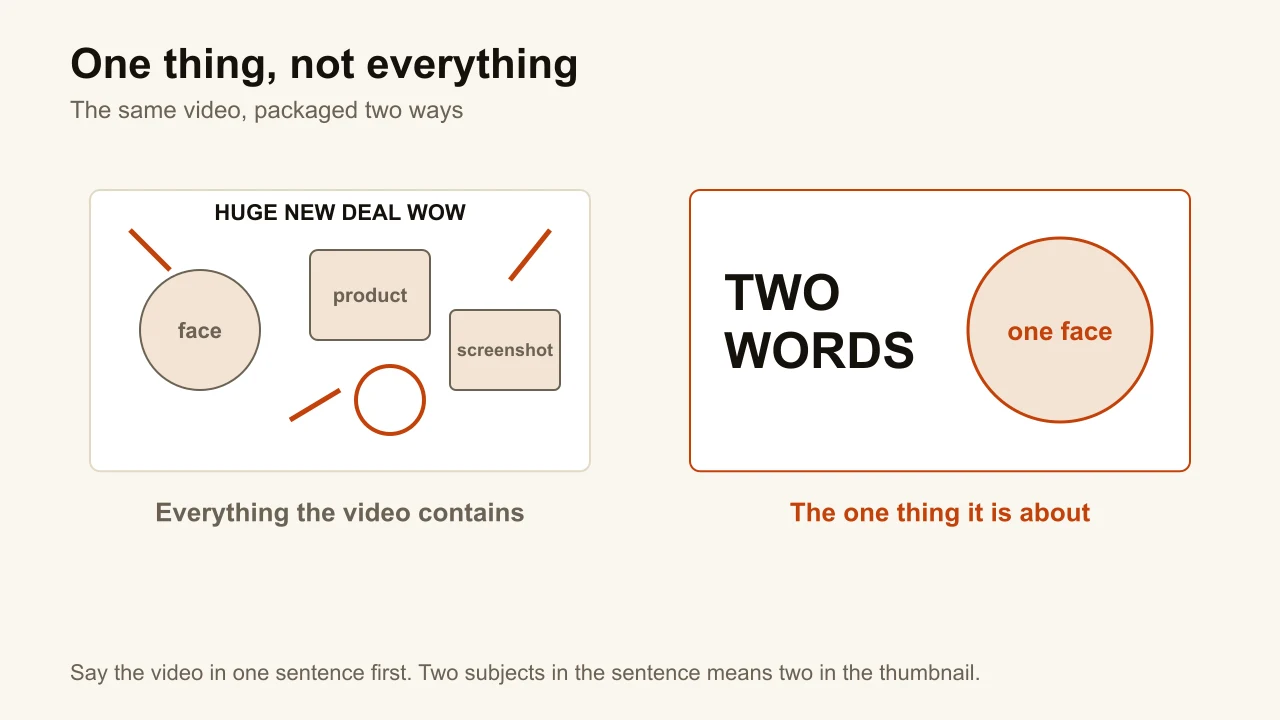
A quick test before you open any tool: say what the video is about in one sentence. If the sentence has two subjects, the thumbnail will too, and the viewer will choose neither. If the sentence is clear but the picture is not, twelve YouTube thumbnail ideas match a format to each kind of payoff, with the brief behind each example.
Step 2: get the subject, with contrast and a real expression
The subject has to separate from the background at a glance. That is what lets your brain register it in a fraction of a second while scrolling, and it matters more than any colour choice: a subject that blends into a similarly lit, similarly coloured background disappears in the feed however sharp it is. A warm face on a cool background, a bright object on a dark one, a lit side against a dim side.
If a person is in frame, the expression has to match the video's actual energy, pushed slightly further than feels natural. A flat face reads as "nothing is happening here". Shock, joy, focus, tension, whatever the content earns. This is also where AI-generated faces fall apart: a smoothed-over, waxy face reads as fake at a glance, and a fake face undercuts the emotional read you were going for.
Where the subject comes from is the real choice at this step. Shoot it, and take several frames during the shoot so you have options, which is YouTube's own advice. Or generate it: this is what ThumbnailMaker's AI thumbnail maker does from the video's link, with the contrast, the expression and the texture rules built into the brief, so the plastic look is fought before the model draws a pixel. Remove this step and the rest of the list has nothing to work on.
Step 3: compose in 16:9 at 3840 × 2160
Compose for the final shape from the start, not by cropping afterwards. A 4:3 photo cropped to 16:9 technically fits, the way a shirt one size too small technically fits: the subject sits too high, the text collides with the edge. The exact YouTube thumbnail sizes are 3840 × 2160 recommended and 1280 × 720 still accepted, both 16:9; Shorts are the same thing upright, 9:16.
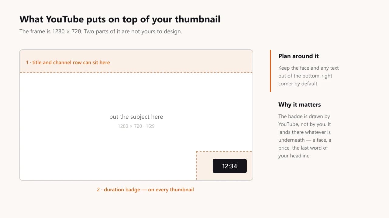
Two things get placed on top of your thumbnail that you do not control: the video-duration badge in the bottom-right corner, and, depending on the layout, the title and channel row underneath or over the top band. The duration badge is an uninvited guest that always sits in that corner, whether you planned around it or not. Keep that corner visually simple by default.
Step 4: add five words or fewer, or none
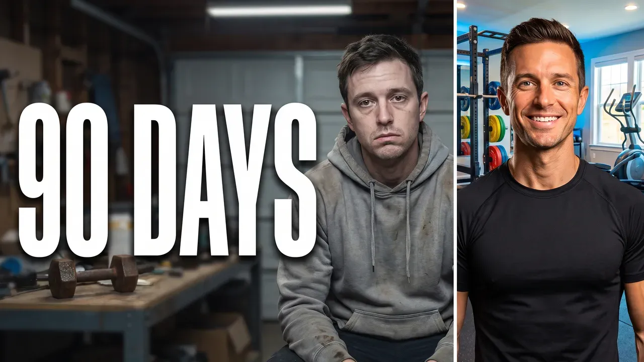
Text should support the image, not repeat what is already obvious from it. Five words or fewer; beyond that it becomes unreadable at small sizes and competes with the subject instead of reinforcing it. If the image alone tells the story, no text is often stronger. "90 DAYS" on the before/after above does the work; "MY 90 DAY HOME GYM TRANSFORMATION" would not, because the title already says that right next to it.
When the words go on an image you already have, the free thumbnail text editor draws them in 14 thumbnail fonts, with an outline, and shows the result at 168 pixels while you type.
Step 5: check it at feed size
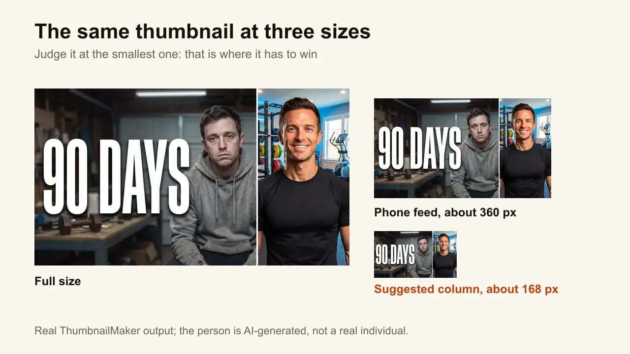
Shrink it to the size it will be judged at before anyone else does. The suggested-videos column shows a thumbnail about 168 pixels wide; the phone feed around 360. The free thumbnail tester puts the image in a mock feed at both sizes, next to a title, with the duration badge in place, and measures the badge corner, the contrast and the clutter. Or just squint at it. Either way, the question is the same: does it still read instantly? If the subject, the emotion and the text survive at 168 pixels, it will do its job. If they do not, go back to step 1, not step 4: the fix is almost always fewer things, not bigger text.
Step 6: upload it, then read the right number
Once the design is right, adding it to the video takes fifteen seconds in YouTube Studio, and the upload option stays hidden until the channel is phone-verified. After a week, read the click-through rate against your own channel's other videos, not against a global number; what counts as a good CTR explains the 2% to 10% band YouTube publishes and why a high rate with low watch time is the clickbait signal. For a video that matters, make three different thumbnails and let YouTube's A/B test decide on watch time.
Do thumbnails actually increase views?
Yes, and that is YouTube's position, not an opinion: its thumbnail and title tips page states that 90% of the best-performing videos have custom thumbnails. The mechanism is the impression: YouTube shows your thumbnail, and whether it turns into a view depends on the half-second decision the six steps above are designed for. A thumbnail cannot make a bad video perform, but a bad thumbnail stops a good video from being tried.
What do YouTubers use to make thumbnails?
Three kinds of tool, and the choice is about time rather than quality. A photo editor (Photoshop, or a free Photoshop alternative such as Affinity or GIMP) when you shoot your own subject and want full control, at 15 to 30 minutes a thumbnail. A template editor (Canva and the Canva alternatives built for thumbnails) when you want a layout fast and accept that the subject is still yours to supply; the comparison with Canva goes row by row. An AI generator when the subject itself is the bottleneck: it makes the image from a description or the video's link and applies the rules above by default, which is what how an AI thumbnail maker works explains. Whichever you use, the six steps do not change; only who does step 2.
Quick checklist before you publish
Six questions, one per step. A "no" on any of them is a reason not to upload yet.
- One focal point: could you cover everything except one element and still have the thumbnail make sense?
- Contrast and expression: does the subject separate from the background at a glance, and does the face match the video?
- Shape: is it 16:9 (9:16 for a Short), composed for that frame rather than cropped into it?
- Text: five words or fewer, or none, and nothing the title already says?
- Bottom-right corner: is anything important sitting where the duration badge will cover it?
- Feed size: does it still read at 168 pixels?
ThumbnailMaker Team — Guides from the people building ThumbnailMaker: thumbnail design, CTR, and what happens under the hood of an AI generator. Every number is checked against YouTube's own pages and dated.
Try it on your next video
Paste the video's link: the brief is written for you, then you generate with a plan from $12 a month.