
Quick answer: the best YouTube thumbnails share one trait: they still read at 168 pixels wide, the size of the suggested-videos column. Each shows one subject, usually a face reacting to something you can also see, or one object doing something unexpected, with strong contrast and two to four words that add what the picture can't say, or no words at all. They leave the bottom-right corner to YouTube's duration badge. Ten patterns cover most famous thumbnails: one subject, a face with its cause, two things side by side, before and after, a curiosity gap, the threat the subject can't see, words that name the idea, the object as the story, one hot colour on a cold scene, and the 9:16 Shorts cover. Below, each pattern has a famous video to look at, one of our own examples, the reason it gets the click and how to make one like it. Copy the pattern, never the picture.
To make one from your own video, ThumbnailMaker's AI thumbnail maker writes the brief from the link and draws the words in. Your first 3 thumbnails are free, with no card; after those, a plan from $12 a month.
Search for the best YouTube thumbnails and you get Pinterest boards, Behance projects and Reddit threads: hundreds of pictures, no reasons. A gallery shows you what worked once. It doesn't say which part worked, so a copy usually keeps the wrong part.
This page names the pattern under each famous thumbnail. The famous videos are linked, not shown: their thumbnails belong to their channels, and a channel can swap one at any time, so each description is dated November 13, 2026. The pictures on this page are ThumbnailMaker outputs, and every person in them is AI-generated.
What do the best YouTube thumbnails have in common?
They are built for the size they are judged at. A thumbnail is seen at about 360 pixels wide in a phone feed and 168 in the suggested column, next to a title, for a second or less. At that size, detail disappears and only shapes, faces, colour and two or three big words survive.
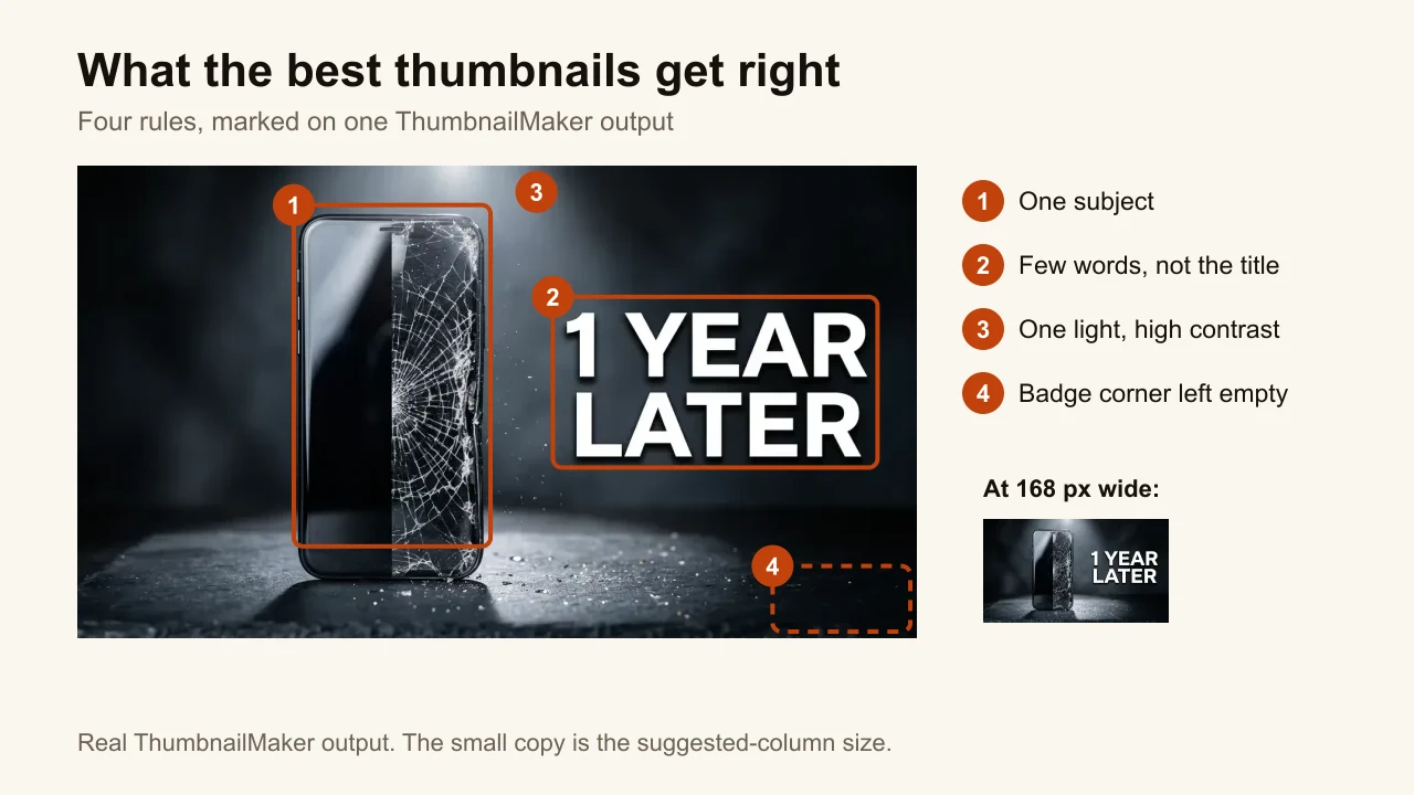
Four rules hold across every pattern below:
- One focal point. The face, the object or the two things being compared. A collage of subject, product, arrows and screenshots is the most common thumbnail mistake.
- Contrast between the subject and the background. Light against dark, warm against cold. The eye lands on the brightest, most saturated area first.
- Five words or fewer, or none. The words add what the image can't show. They never repeat the title.
- The bottom-right corner left empty. YouTube stamps the duration there over whatever you put underneath.
The step-by-step version, from picking the subject to checking it at 168 pixels, is in how to make a YouTube thumbnail that gets clicks.
1. One subject, big enough to read at 168 pixels
Famous example: MrBeast's $456,000 Squid Game In Real Life!. On November 13, 2026, its thumbnail is his face in a red hoodie, half covered by a cracked black mask, on a scuffed grey surface. No words, no set, no contestants.
Why it works: the video recreates a whole game show, and the thumbnail shows one face. One shape is what survives being shrunk. The title carries the number, so the picture doesn't have to.
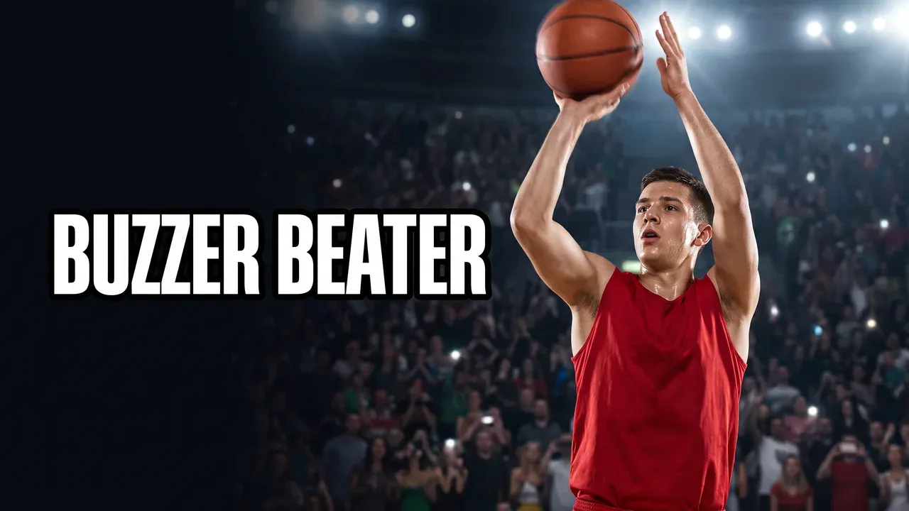
Make one like this: describe the single moment, not the whole video. In ThumbnailMaker, Sports Action with "a player rises for a jump shot at the buzzer" gives one athlete filling one side.
2. A face reacting to something you can see
Famous example: MrBeast's I Spent 50 Hours Buried Alive. The thumbnail shows him in a tuxedo, lying in an open coffin at the bottom of a grave, one hand reaching at the camera, mouth open.
Why it works: the face supplies the emotion and the coffin supplies the reason. A shocked face with nothing to be shocked about reads as a stock photo. Both in one frame, and the viewer reads the situation in one glance.
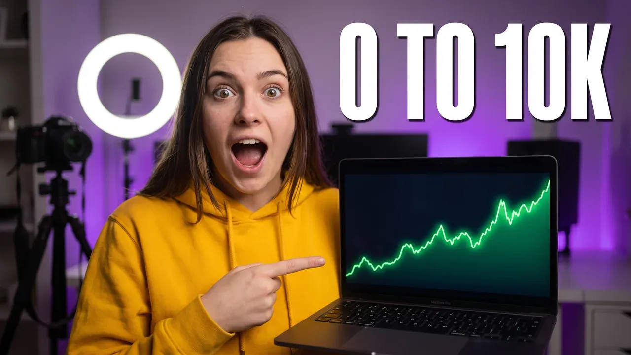
Make one like this: put the cause in the description, not only the expression. The shocked thumbnail page has the Shocked Reaction style on real outputs, cause included.
3. Two things side by side
Famous example: MrBeast's $1 vs $100,000,000 Car!. A rusted wreck in a field on the left, a gold supercar on water on the right, "$1" and "$100M" in the top corners, his grin in the middle.
Why it works: the viewer does the subtraction without being asked. The gap between the two sides is the whole pitch, and it reads before any word does.
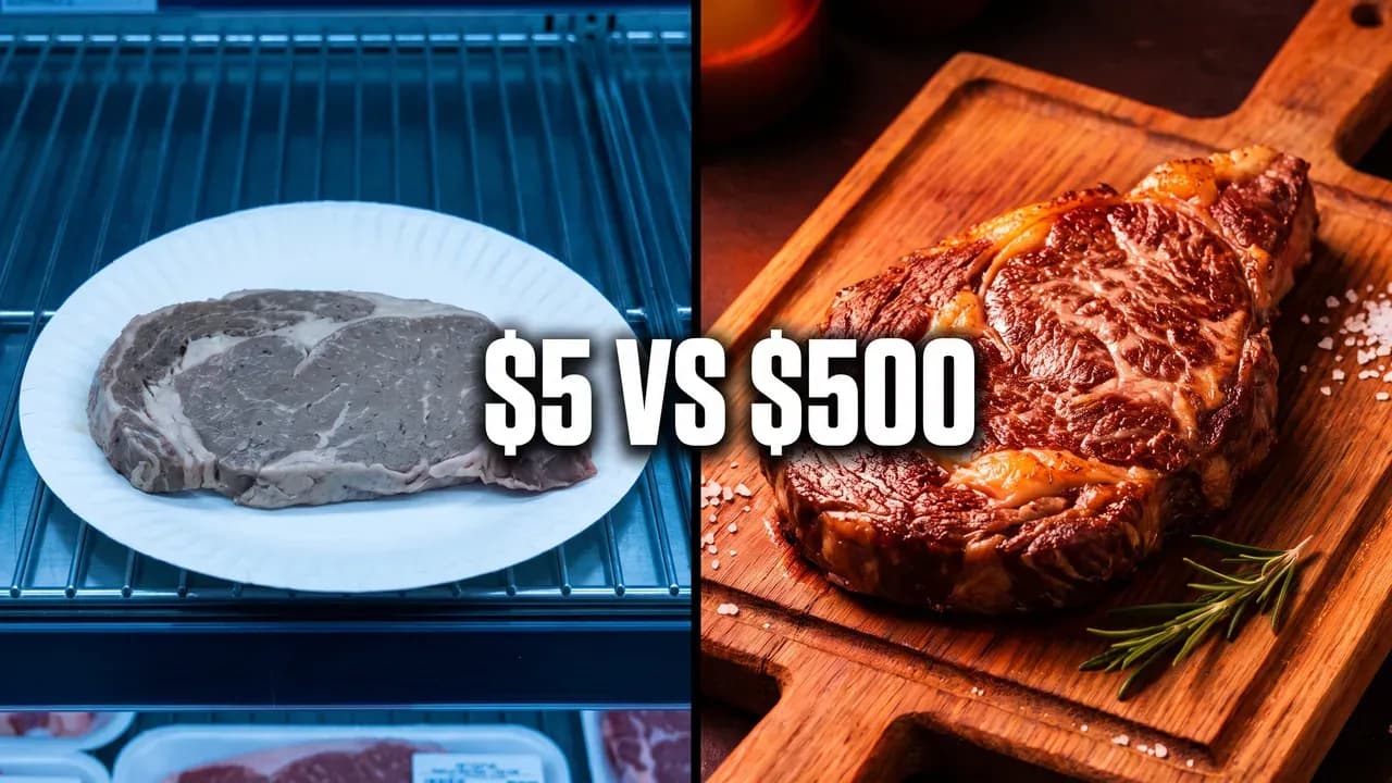
Make one like this: give each side its own light and colour, not only its own label. The Versus style keeps both subjects the same size with a clean dividing line.
4. The same subject, before and after
Why it works: a transformation video promises a change, and the thumbnail shows the change already done. The viewer clicks to see how. The light should change as much as the subject: dim and grey before, bright after. Without that, the split turns to mush at feed size.
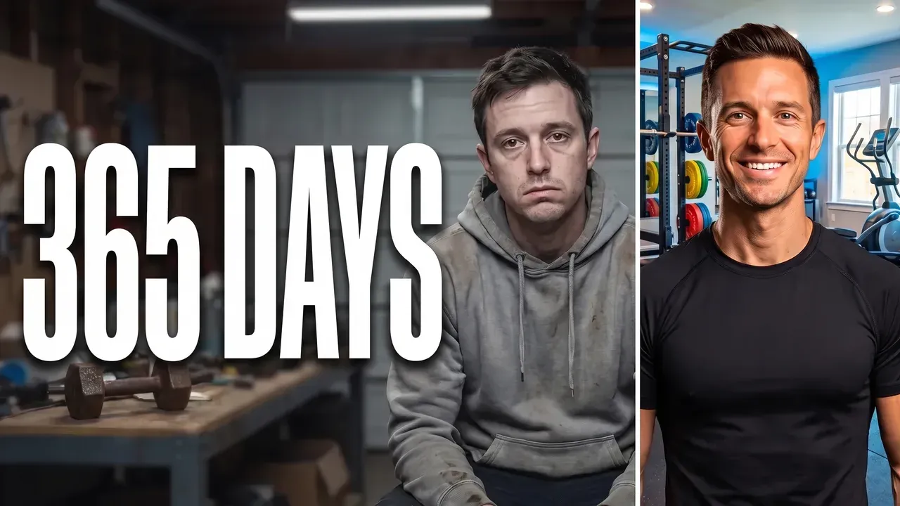
Make one like this: Before/After, one sentence for each side, and the time it took as the words.
5. A curiosity gap: the setup shown, the payoff hidden
Famous example: Veritasium's Why No One Has Measured The Speed Of Light. A single blue beam across a black frame, and two words: "IT'S IMPOSSIBLE".
Why it works: the words make a claim the viewer can't settle without watching, and the image gives nothing away. It is also the cleanest contrast on this page: one bright line on black. A curiosity gap only pays off if the video answers the question; when it doesn't, the click turns into a short view, which is the clickbait signal YouTube reads.
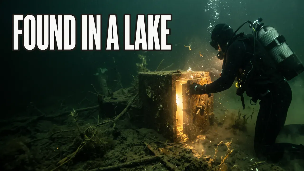
Make one like this: describe the moment just before the reveal. In ThumbnailMaker, Horror / Mystery keeps one detail lit and the rest dark.
6. The viewer sees what the subject doesn't
Famous example: MrBeast's I Got Hunted By A Real Bounty Hunter. He presses against a brick wall in a jungle; on the other side, a man in sunglasses holds a knife.
Why it works: the viewer knows more than the person in the frame, and wants to see it play out. Two characters, one frame, and the tension sits in the gap between them.
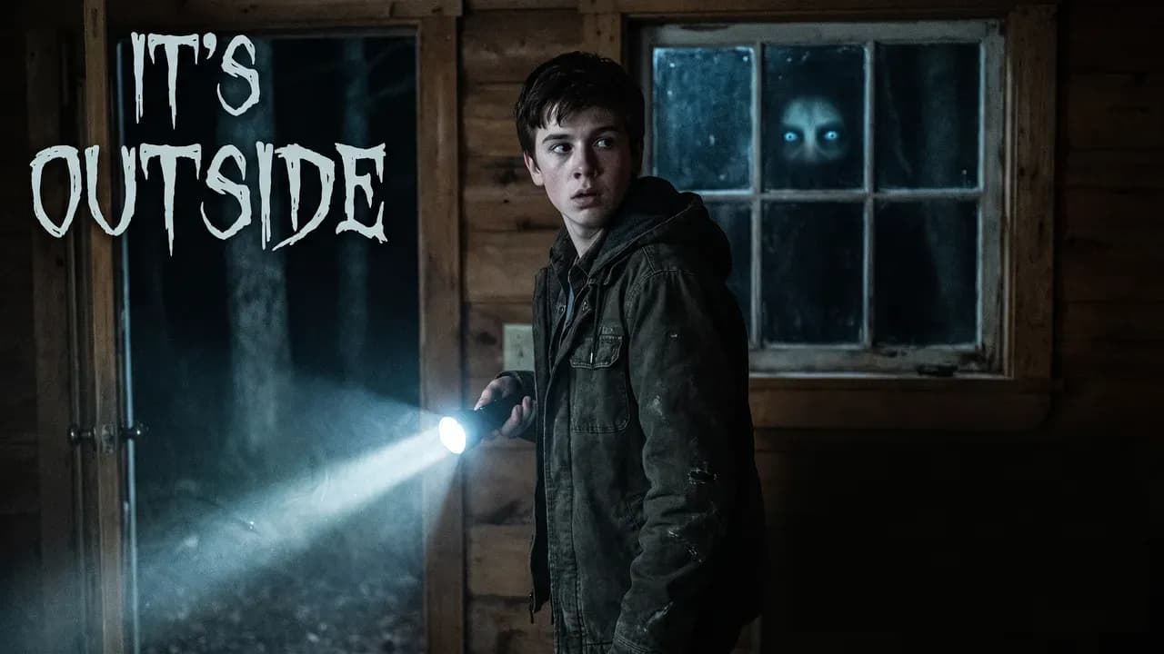
Make one like this: put the threat in the description behind the subject: "two glowing eyes in the window behind him". Horror / Mystery lights the face and leaves the threat half in the dark.
7. Words that add what the picture can't show
Famous example: Veritasium's The Most Misunderstood Concept in Physics. Clouds of coloured ink and one word: "ENTROPY".
Why it works: entropy can't be photographed, so one word names it and the ink suggests it. The title asks a question, the thumbnail gives the topic. They work as a pair and never repeat each other.

Make one like this: write the words last, after the scene. Ask what the image can't say, and say only that, in five words or fewer.
8. The object is the story
Famous example: Mark Rober's Glitter Bomb 1.0 vs Porch Pirates. A parcel bursts into a cloud of glitter on a doorstep, a white arrow pointing at it, a hand reaching in from the side.
Why it works: there is no face to read, so the object has to do something no one expects. It works for faceless channels and product videos: the thing itself, shown in the state that makes the story.
Make one like this: describe the object in the state that tells the story, not on a clean white background. Tech / Review keeps it sharp under studio light.
9. One hot colour against a cold scene
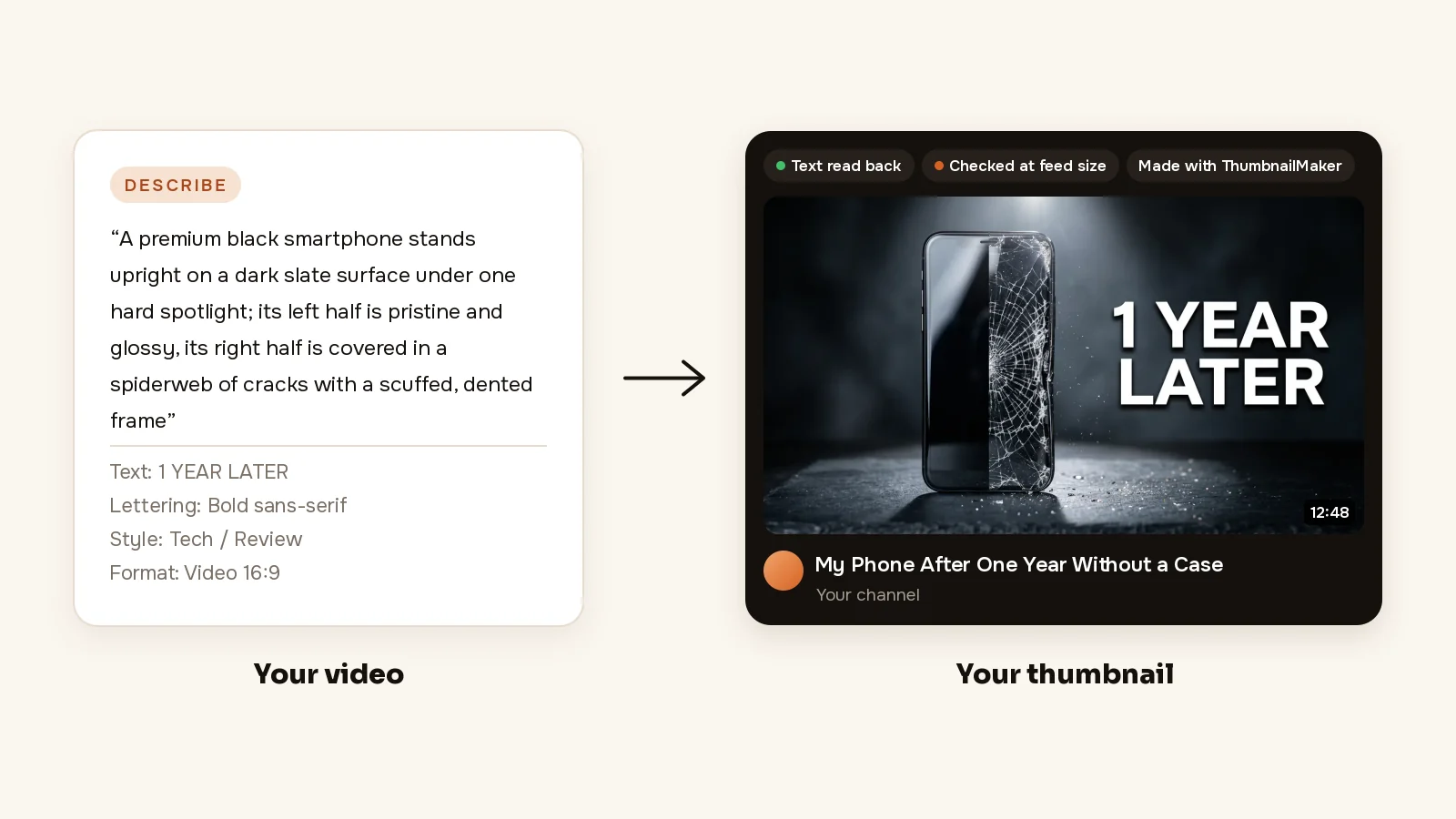
Why it works: a frame that is mostly teal, steel and night blue makes one orange flash impossible to miss. One accent tells the eye where to go. Five accents tell it nothing, which is why a thumbnail with every colour turned up reads as noise.

Make one like this: name the one warm light in the description, "an orange explosion lighting one side of his face", and keep the rest of the scene cold. Tactical Shooter is built on that contrast.
10. The Shorts cover, a different shape
Why it works: a Short's cover is 9:16, and the Shorts shelf draws the title and buttons over its bottom part. The covers that read keep the subject and the words in the middle band, big enough for a frame about 189 pixels wide. A 16:9 thumbnail cropped to fit loses whatever sat on its sides.
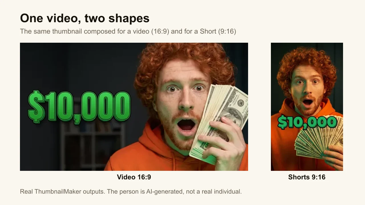
Make one like this: choose Shorts 9:16 before generating instead of cropping a 16:9. The YouTube Shorts thumbnail maker page shows covers made that way.
What is the best thumbnail style for YouTube?
There isn't one: the best style is the one that shows what your video delivers. A reaction video sells a face; a build sells the result; a comparison sells the gap. Match the pattern to the payoff:
| The video delivers | Pattern | ThumbnailMaker style |
|---|---|---|
| A reaction, a discovery, a big moment | 2. A face with its cause | Shocked Reaction |
| An upgrade, a price test, a rivalry | 3. Two things side by side | Versus |
| A transformation, a challenge over time | 4. Before and after | Before/After |
| A mystery, an investigation, a story | 5 and 6. Curiosity gap, the unseen threat | Horror / Mystery |
| A product, a faceless explainer | 8. The object as the story | Tech / Review |
| A gaming highlight | 1 and 9. One subject, one hot colour | Tactical Shooter, Victory Moment |
Twelve more formats, each with the exact brief that produced its example, are in YouTube thumbnail ideas.
How do you know your thumbnail works?
Look at it where it will be judged: small, in a feed, next to other thumbnails and a title. The free YouTube thumbnail tester puts your image in a mock feed at real sizes, with no account.
Then let viewers decide. YouTube's A/B testing runs up to three thumbnails, three titles or both on one video, in YouTube Studio on a computer, and picks the winner by watch time, not by clicks. That choice is deliberate: a thumbnail with a high click-through rate and a short average view is what YouTube reads as clickbait. Shorts can't be tested this way.
Make one like these
Pick the pattern that matches what your video delivers, then make it from your video's link: ThumbnailMaker proposes three angles from the video, draws the words in and checks them at feed size before you download.
ThumbnailMaker Team: Guides from the people building ThumbnailMaker: thumbnail design, CTR, and what happens under the hood of an AI generator. Every number is checked against YouTube's own pages and dated.